
- Case Studies
PROBLEM
Since 2010, the non-profit Destination Education (DE) has been working to build a college-going culture in the greater Holland, Michigan, community. To do so, DE provides programs, services, and resources that lower barriers for students seeking to continue their education beyond high school.
In recent years, however, DE had been struggling to achieve its mission. Low awareness of DE, as well as a lack of urgency within the community to address the issue of low educational attainment, wasn’t making the organization’s work easy.
In 2016, DE’s board began a “re-visioning” process. They took a close look at their mission and approach and created an action plan to guide their work in the coming years. During the process, the board determined that DE’s outdated visual identity and lack of a consistent communication strategy were roadblocks to their success.
“We realized that we needed a clear message and plan to share our mission,” said Jim Schoettle, Destination Education Board Vice President.
Enter 2 Fish Company. As long-time neighbors of DE, our team was ready to help.
SOLUTION
To eliminate the confusion surrounding DE’s mission due to inconsistent communication in the past, 2 Fish Co. began working with DE’s communication team to develop a new marketing communications strategy and an updated visual identity.
Through hours of meetings with the board and communications team, we gained an in-depth understanding of DE’s goals for these new elements: educating the public, engaging students and families, securing funding, and recruiting partners with similar goals.
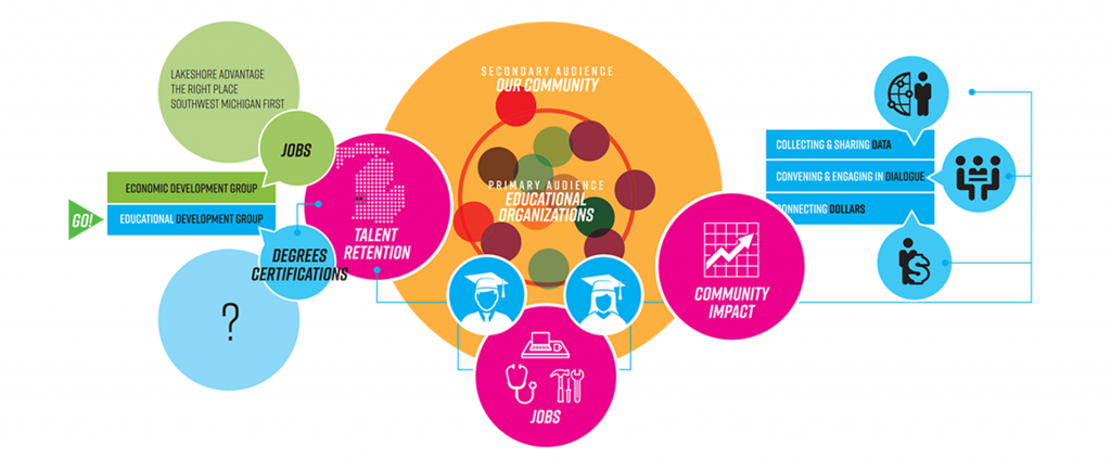
Our first order of business was developing a mission map that outlined DE’s new brand position and communications strategy.
Our team realized that the mission, approach, and audience of DE parallel those of an economic development group, with a focus on education rather than jobs. We suggested that DE rebrand as an “educational development group,” as the organization’s audience – businesses, foundations, and the community at large – already understands and uses the language of development agencies.
With this new brand position in mind, we crafted a simplified communications strategy that would allow DE to communicate even more clearly and professionally about the work they do and why they do it.
We called the resulting strategy “the 3D’s,” as DE works to achieve its mission through an open dialogue with anyone invested in increasing opportunities for first time college-bound students, aggregating and disseminating critical data regarding student achievement, and connecting organizations in need with dollars that are available via donors, funds, and grants.
“2 Fish Company spent time getting to know who we are as an organization,” said Jim Schoettle.” They listened, helped us match our brand with our mission, and were open to our input. They took us beyond our design thoughts and created a concept that fit our mission, brand needs, and is flexible in how we use it.”
Approved by the board, the mission map, brand position, and communications strategy became a launch pad for the creation of marketing tools and a new visual brand.
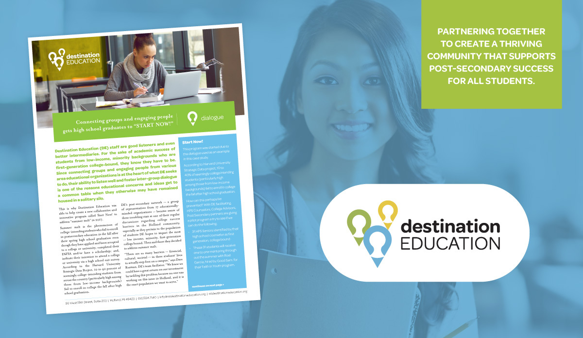
We first developed three case studies that featured information about DE’s work. For each “D” of the 3D’s strategy, we created a case study. We reasoned that the data-based approach would be an effective way to appeal to DE’s potential partners and donors in the business community.
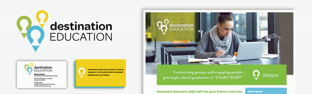
Our next task was to redesign DE’s visual identity.
“Along with all of our efforts to communicate more clearly about who we are, we knew that we needed an identity that better represented who we are,” said Deb Feenstra, Executive Director of Destination Education.
While crafting the new visual identity, we focused on eye-catching colors and playful designs. The professional-yet-friendly logo, color palette, and typefaces were applied to the newly-developed case studies and to the presentation template – for fundraising and education use – that we created next.
“The pieces that we developed are really about supporting efforts to help disadvantaged students get into college,” said Martin Schoenborn, our Creative Director. “Each specific aspect was made with that goal in mind. For instance, the updated logo is intentionally not corporate and is designed to be inviting to youth.”
We also created simple brand guidelines for DE so that they can maintain visual consistency across all messaging going forward.
RESULTS
The new communications strategy, marketing tools, and visual identity enable DE’s employees and partners to communicate with increased clarity and represent the organization more accurately.
As they have already been received warmly by community partners, DE is optimistic that the elements will encourage more engagement from the community as a whole.
“We are excited to have a visual brand and communications strategy that we are proud of and that will help us build a strong and vibrant community both now and in the future,” said Jim Schoettle.
Our team is looking forward to watching Destination Education achieve its goals. We’ll be right alongside the organization to provide further support.
SHARE IT!


-
Case Studies
POWER X1 Launch
-
Case Studies
Trade Show Booth Redesign