
- Case Studies
Problem
A strong, distinctive logo is critical to the success of a brand. When carefully crafted and used properly, it can set an organization apart from competitors and become a positive mental cue. A logo must represent the essence of a company; its purpose, its personality, its “feel.”
No pressure for logo designers, right?
When Michelle Filips was starting her business, GarenHuis, she approached 2 Fish Company for logo design.
GarenHuis, which means “yarn house” in Dutch, is a—you guessed it—yarn shop located in downtown Holland, Michigan.
The name was inspired by Filips’ Dutch roots. The town of Holland is also known for its Dutch heritage, as well as for its cozy, welcoming downtown area that is frequented by locals and tourists alike. Filips knew downtown Holland would be a perfect home for GarenHuis, as she planned for her store to have a similarly cozy atmosphere. Her vision was to offer not only a wide array of yarns but also knitting and crocheting classes and a comfortable living room area where individuals or groups could come in to knit, share their craft, and build a community.
“A lot of small yarn shops have a reputation for being cliquish, snobbish, or unfriendly,” said Filips. “We wanted to make sure that that didn’t happen at GarenHuis. We just wanted it to be a place where people can come in and relax and help each other.”
While she did not have specific requests for the GarenHuis logo, Filips charged 2 Fish Company with finding a design that would fit well with the ambiance she envisioned.
Solution
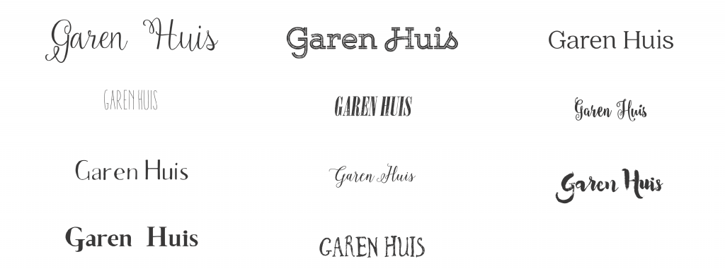
Our first order of business was a font study. We sifted through hundreds of typefaces in search of aesthetically pleasing, customizable options. We chose script fonts that lent a relaxed, folksy feel, as well as strong, stable lettering options to convey a sense of home. We settled on eleven typeset approaches to show Filips.
“All of the type options were chosen to reflect Shelly’s goal of conveying warmth and friendliness,” said Scott Millen, Managing Partner and Creative Principal at 2 Fish Company. “We also wanted to infuse the mark with a sense of handicraft.”
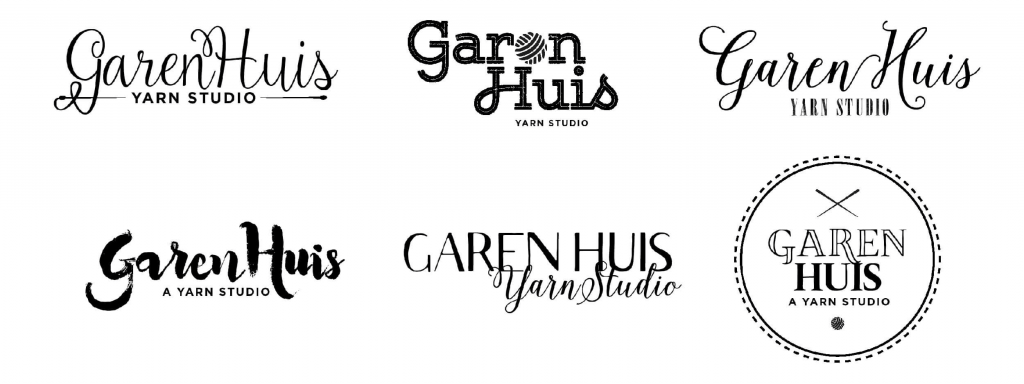
After Michelle chose her favorite typefaces, we designed the first round of logos. Three concepts moved on to the second round.
At this stage, Filips picked her favorite logo design option.
“I chose the concept that I did because it was unique and different,” she said. “If you look at the names and logos of yarn shops, they’re all the same. I liked that this would set GarenHuis apart.”
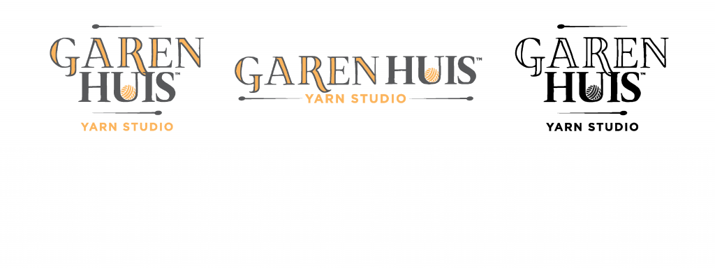
We turned our attention to refining the logo she selected by adding distinctive flourishes.
“Knitting involves a lot of personalization,” said Millen. “We wanted the GarenHuis identity to feel personalized too.”
We modified the shapes of the letters to enhance the folksy feel of the logo. We also refined the positioning of the playful elements—knitting needles and a ball of yarn—that we had incorporated. Michelle suggested that the “U” in the logo resembled a knitting basket, and would be a good home for the ball of yarn.
Once we had our final design, it was time to determine which colors would be part of the GarenHuis identity.
“The colors needed to evoke the feeling and nature of yarn,” explained Millen. “We couldn’t go with magenta and teal, even though they are contemporarily appropriate colors. We picked warm and natural colors.”
We created two potential color families. Filips chose the option that featured warm grey and a butter-with-saffron yellow.
Results
All in all, it took five rounds of design to develop the GarenHuis logo.
“The process of working with 2 Fish Company was great,” said Michelle Filips. “I really had no idea what I wanted, and they sent me many ideas and helped me narrow them down. They were really easy to work with, and I would recommend them to others looking to have a logo developed.”
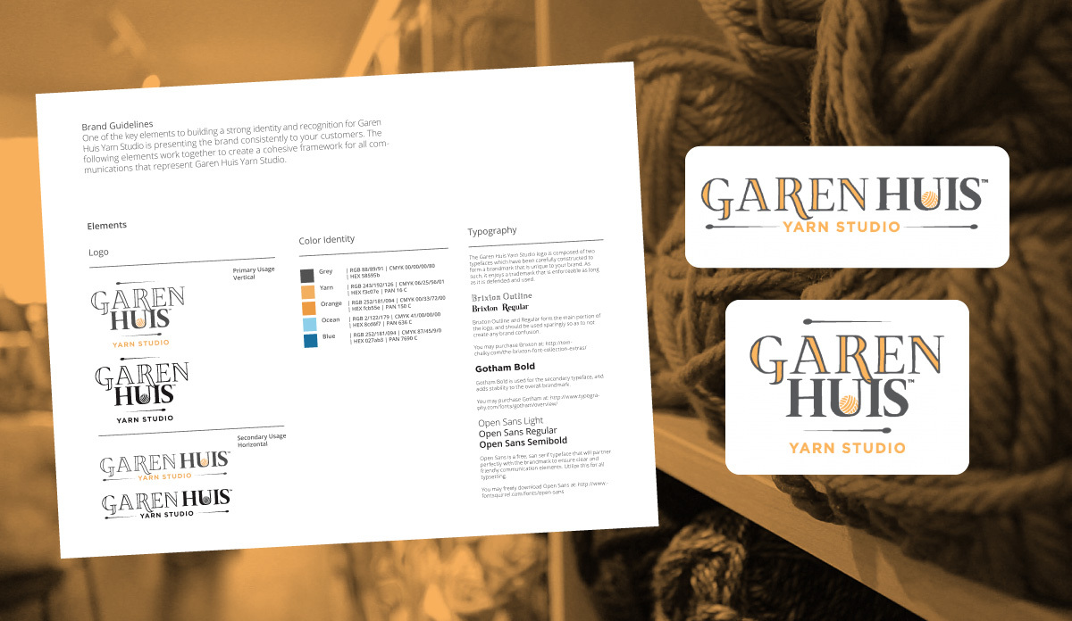
We provided Filips with three final versions of her logo—flat, stacked, and a monogram—so that she would be equipped with an option for any application, whether on a storefront, merchandise, or stationery.
We also created a logo usage guide that outlined best practices for implementation of the logo and gave guidance on color and typography.
“2 Fish Company provided me with everything I could need,” she said. “With several different image formats, I could easily incorporate the logo wherever I needed. That was very helpful.”
For GarenHuis Yarn Studio’s grand opening in November of 2015, Michelle Filips had a distinctive logo that was truly representative of her store.
“It can take many iterations for the right logo design to come about, “ said Scott Millen. “We enjoyed working through that process with Michelle and are glad that she was so pleased with the result.”
He added: “We work hard to understand the nature of each business we work with to create an identity that accurately reflects it. You can get an adequate logo anywhere, but if you spend the time and invest the resources, you can get an identity that is uniquely yours.”
SHARE IT!


-
Case Studies
A Comprehensive Campaign for a Comprehensive Warranty
-
Case Studies
POWER X1 Launch